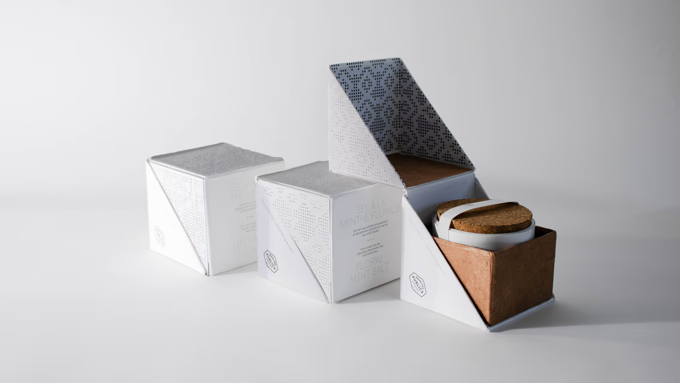
Designed for Marchés publics de Montréal, this sea salt packaging system communicates the literal nature of the product through both materiality and graphics. Guided by the concept of crystallization, the packaging conveys the salt’s characteristics in an indirect, experiential way. This premium sampler system elevates a simple culinary staple into a tactile journey, supporting urban food enthusiasts who appreciate artisanal quality and local connection within the city’s vibrant market landscape.
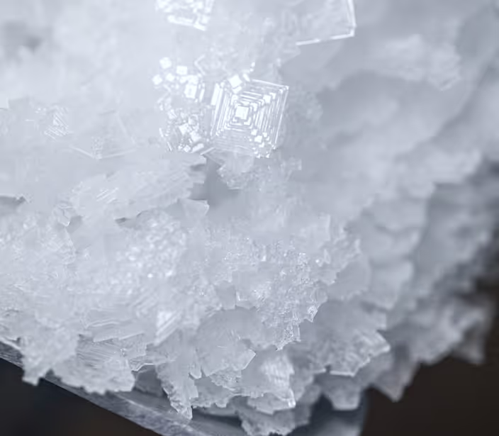
Sea salt production relies entirely on the natural evaporation of saltwater, leaving behind mineral-rich crystals that carry the essence of the marine environment. In culinary traditions, these crystals are celebrated for their pure, unrefined texture and ability to enhance flavours. To reflect this, the packaging system honours the organic geometric structures formed during evaporation, bridging the gap between raw coastal elements and the refined culinary experience offered at Montreal's public markets.



While this sea salt packaging serves as a functional and elegant addition to the Marchés publics de Montréal, its core purpose is to explore how physicality and tactile form can enhance a brand’s sensory impact. By aligning minimalist visual graphics with a highly structural, interactive experience, the packaging invites a deeper level of consumer engagement. This process highlighted the immense value of structural storytelling, demonstrating how a well-considered form can capture user interest and transform a simple, everyday product into a meaningful sensory experience.
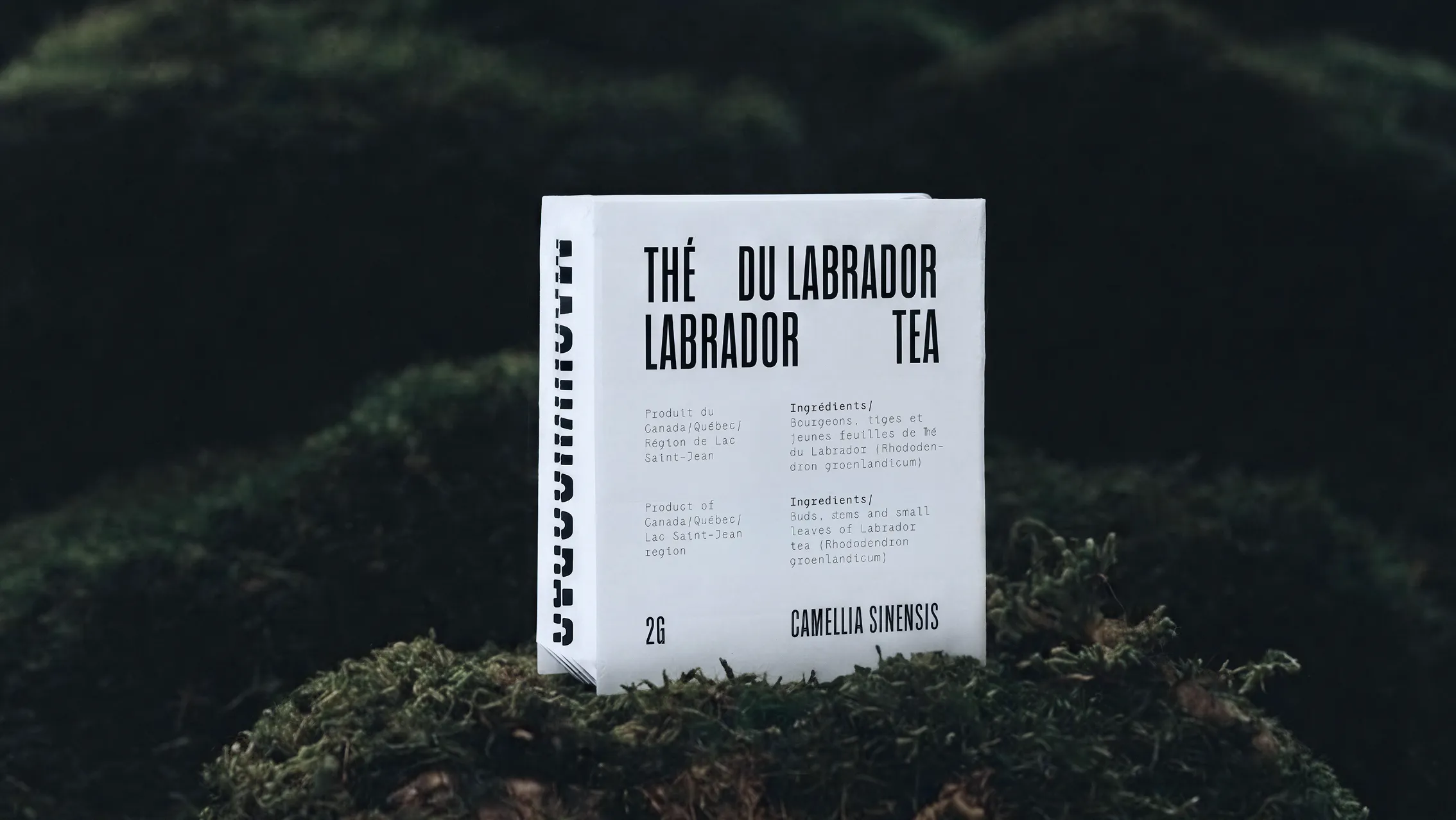
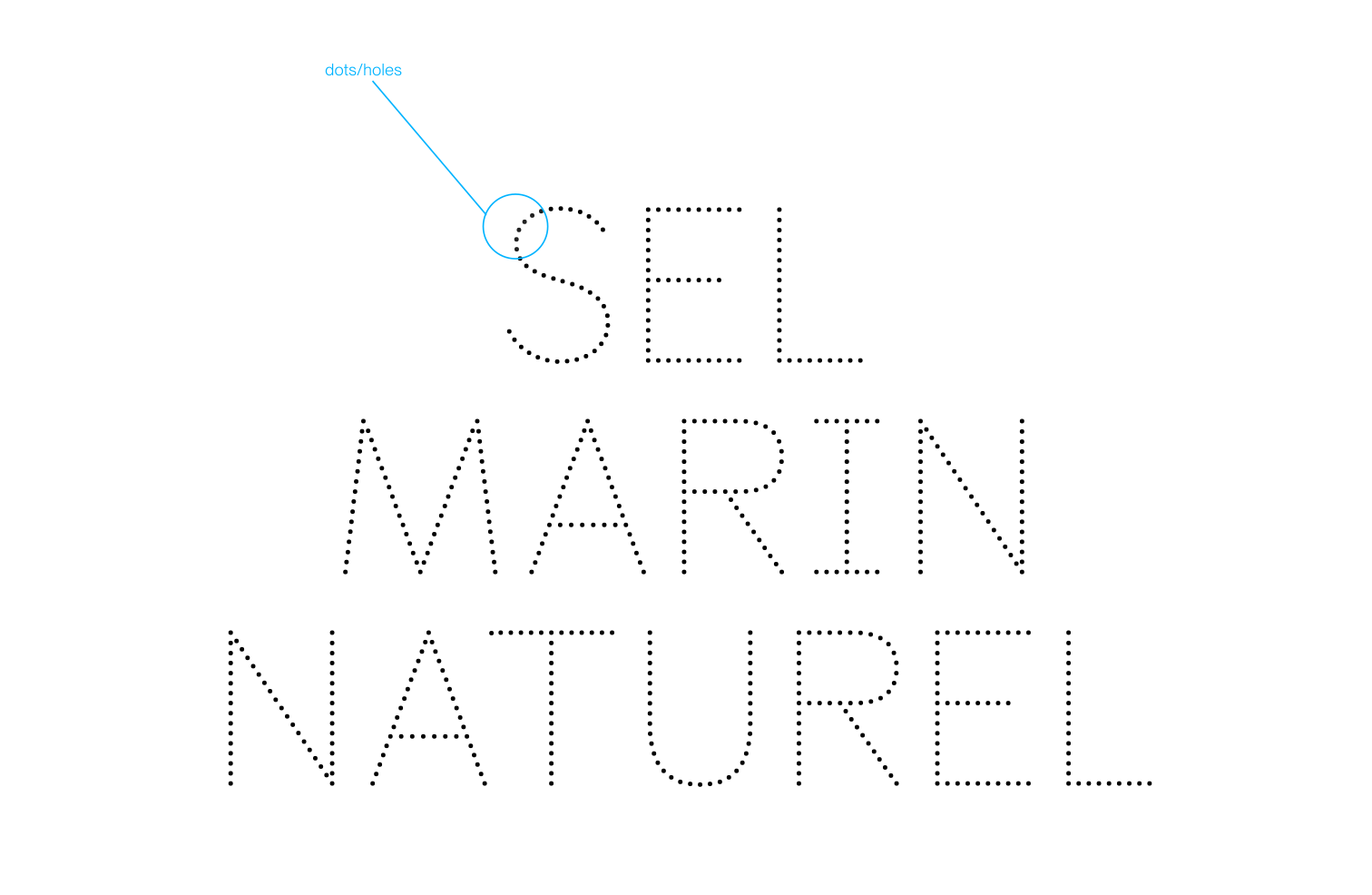
The chosen typeface for this packaging system functions as an extension of the dotted graphic language. “Castledown Dotted Pro” is composed of dots and carries the same subtle visual quality as the patterns, reinforcing the overall graphic system. This approach once again reflects the nature of the product, emphasizing its small scale and granular character.
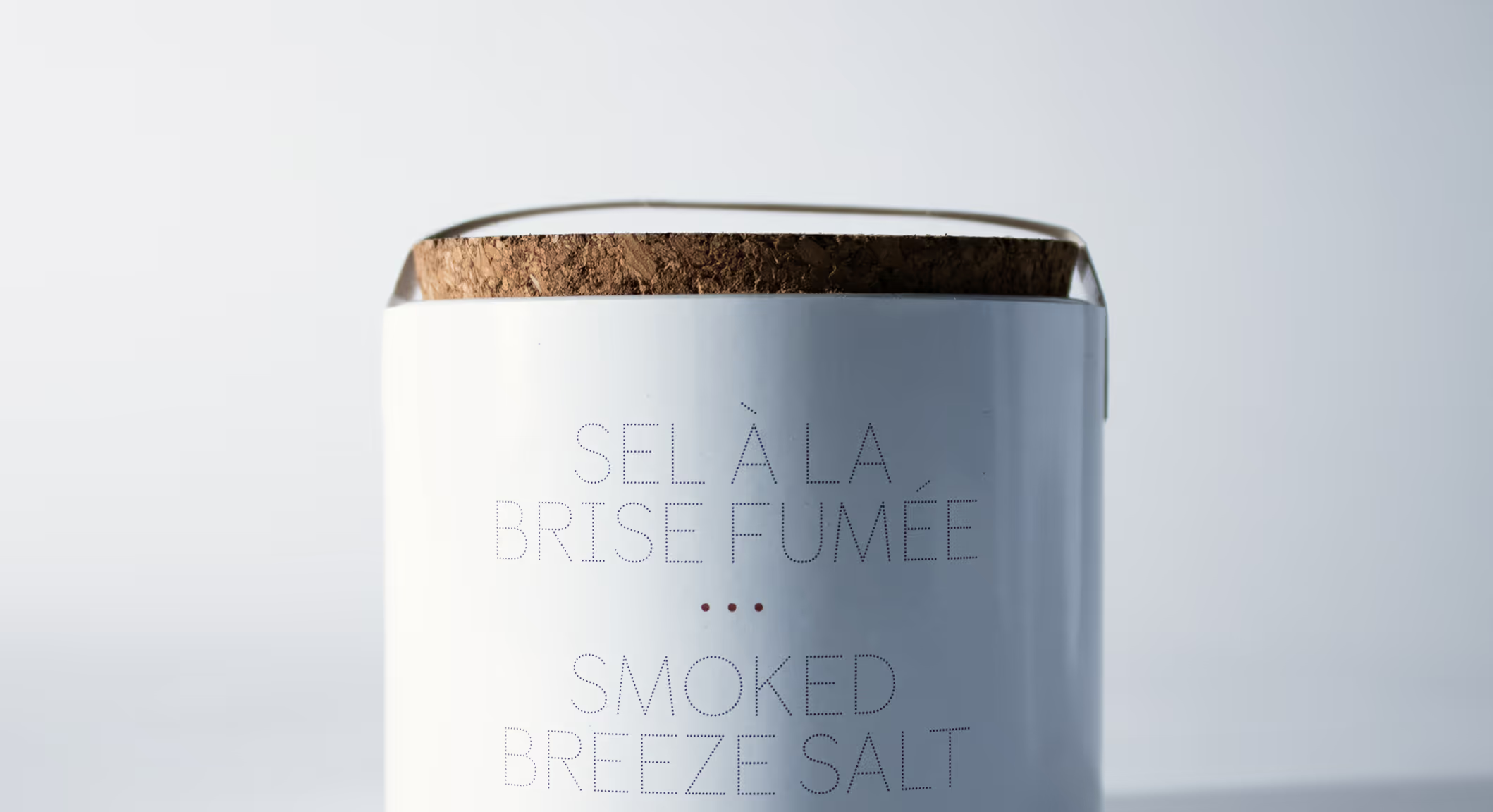
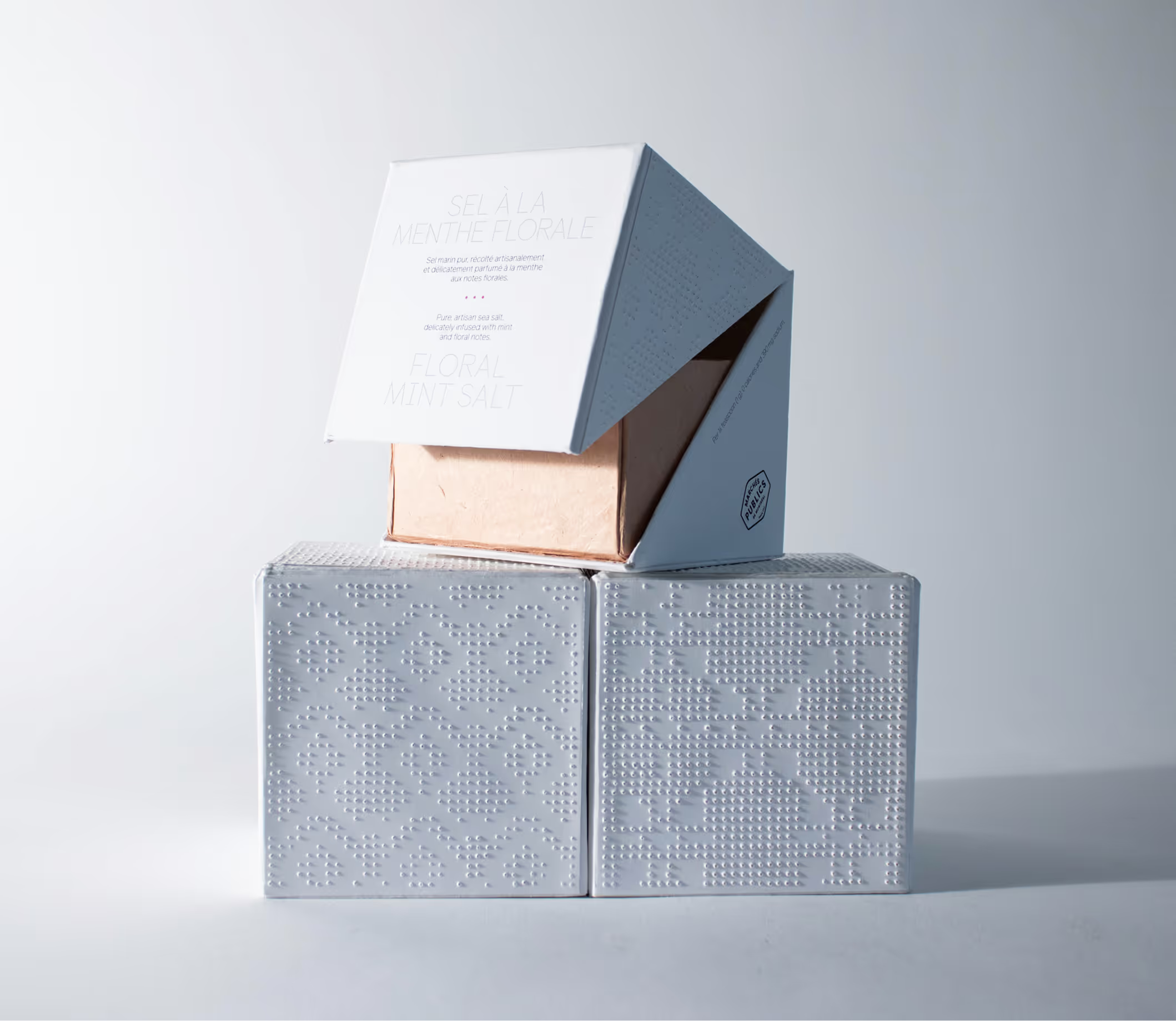
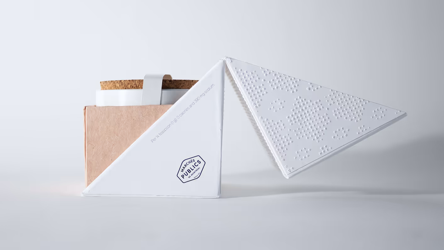
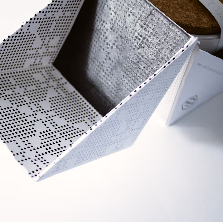
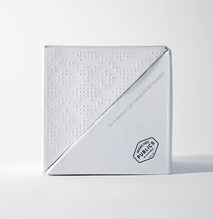
To focus on the product’s key characteristic, the package showcases the geometric forms and physical textures that define natural salt crystals. The box’s structural form and its distinct triangular opening directly evoke the sharp, angular shape of salt crystals. On the surface, an embossed dotted pattern reflects their small scale and rough texture, while tiny perforations subtly mimic the natural sparkle of sea salt flakes whenever light interacts with the surface—inviting users to experience a sense of discovery through physical engagement.
While this sea salt packaging serves as a functional and elegant addition to the Marchés publics de Montréal, its core purpose is to explore how physicality and tactile form can enhance a brand’s sensory impact.