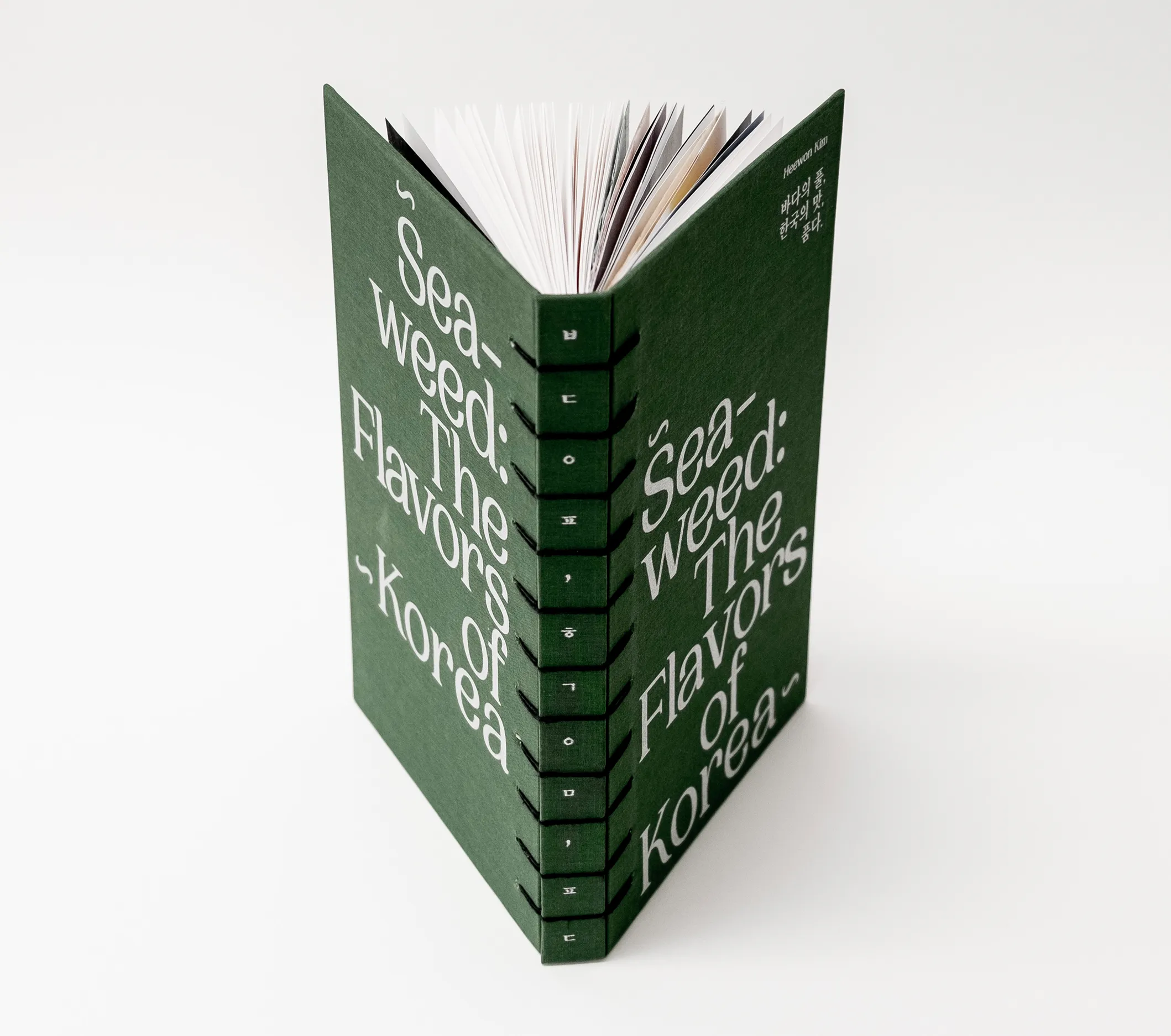
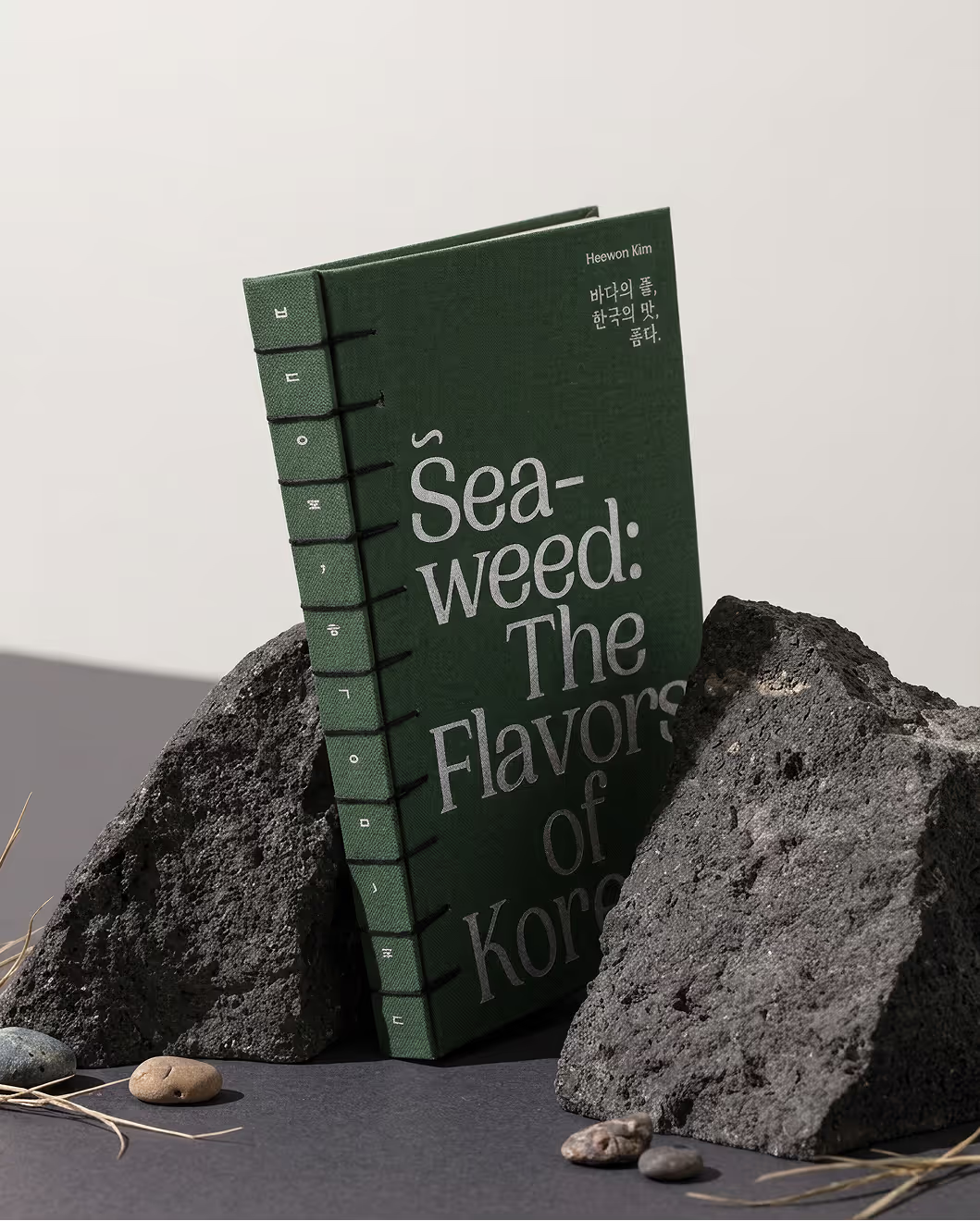
“Seaweed: The Flavors of Korea” is a curated cookbook exploring the versatility of marine algae in Korean cuisine. Organized into three chapters—brown, red, and green algae—it pairs specific species with authentic recipes designed for those unfamiliar with this unique ingredient. This book invites readers to bridge the gap between tradition and their own kitchens, offering a practical guide to experiencing Korean culinary heritage at home.
In Korea, seaweed is a cultural anchor with a 5,000-year history, evolving from a royal tribute to a modern staple. It carries deep symbolic weight—from the restorative Miyeok-guk soup eaten on birthdays to the sustainable heritage of Jeju Island’s Haenyeo divers. By bridging ancient folklore with daily life, seaweed remains a timeless symbol of health, gratitude, and Korea’s enduring connection to the sea.
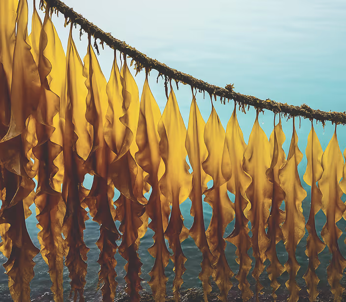


To showcase the unique nature of this cookbook’s main theme in a coherent way through each page, the art direction focuses on the concept of the plant’s natural buoyancy and transparency. The layout mirrors the natural movement of seaweed—rooting it with density at the base while allowing it to float upward. By anchoring recipe titles and body text at the bottom and placing the list of ingredients toward the top, the layout creates a vertical flow that emphasizes the vastness of the deep sea through generous negative space.
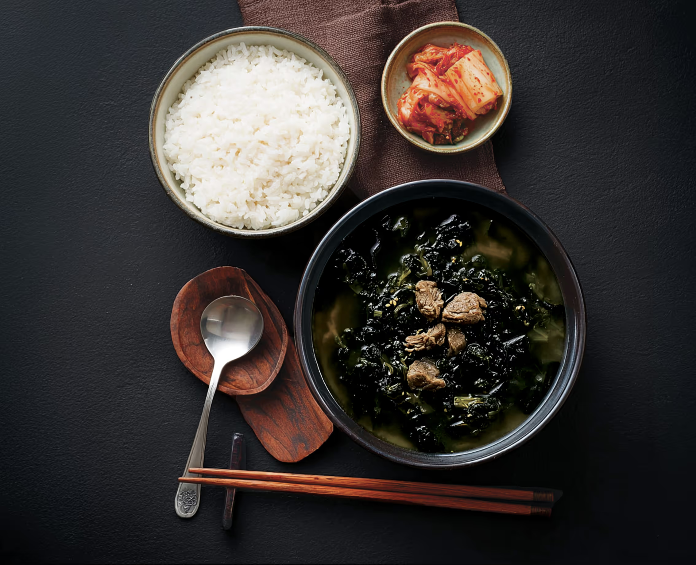
This verticality is reinforced by the running heads and line rules, ensuring a consistent, immersive theme.Complementing this structure, macro photography captured from a bird’s-eye view highlights the overlooked textures and transparency of the algae. High-contrast lighting was used to define the interplay between light and shadow, bringing the rough, intricate details of the seaweed to life.
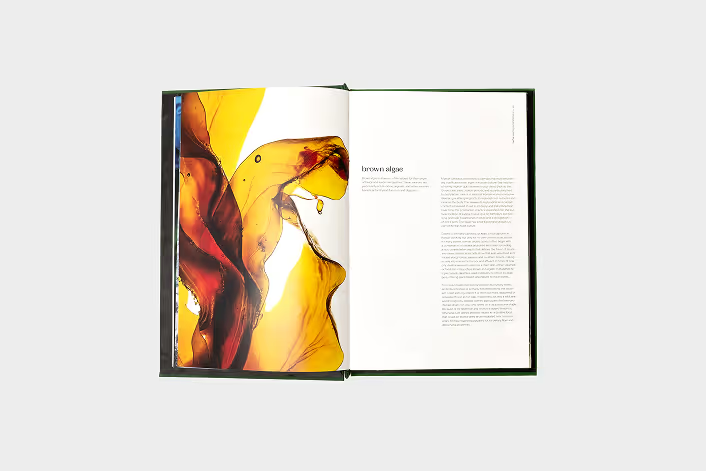
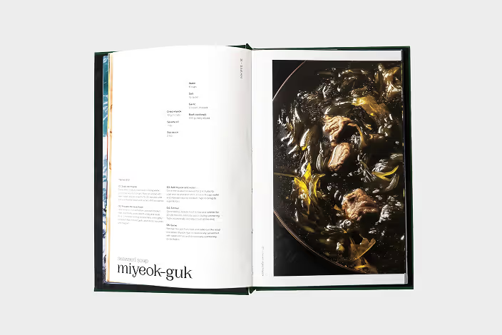
To showcase the unique nature of this cookbook’s main theme in a coherent way through each page, the art direction focuses on the concept of the plant’s natural buoyancy and transparency. The layout mirrors the natural movement of seaweed—rooting it with density at the base while allowing it to float upward. By anchoring recipe titles and body text at the bottom and placing the list of ingredients toward the top, the layout creates a vertical flow that emphasizes the vastness of the deep sea through generous negative space.
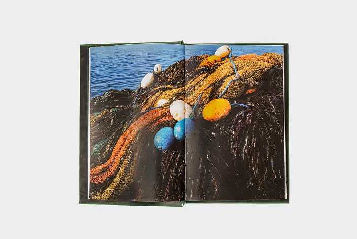
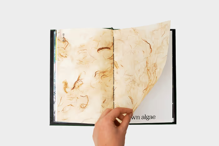
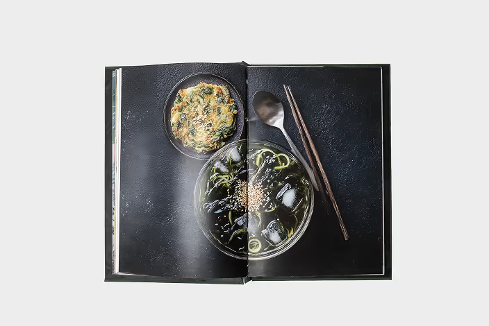
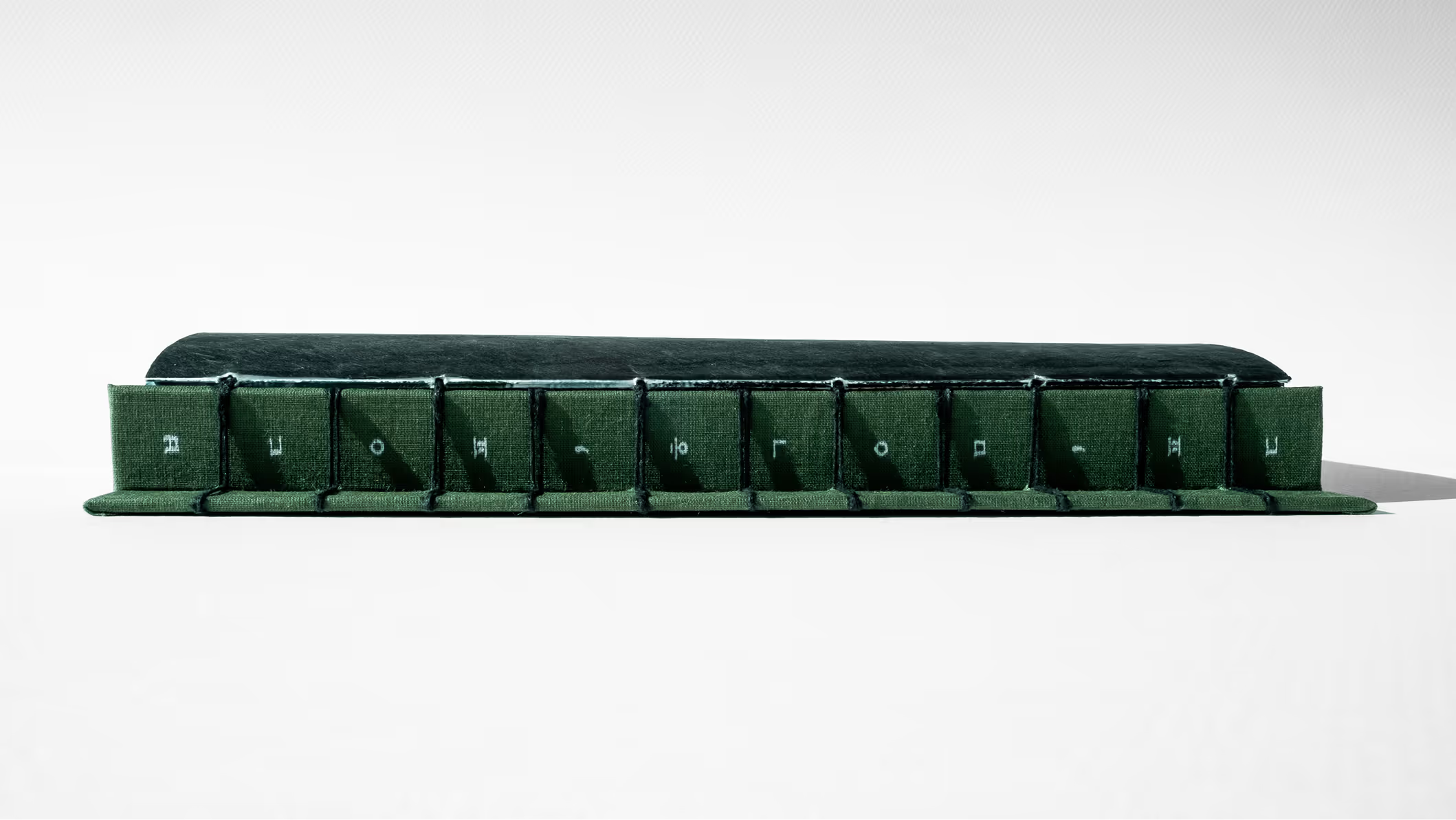
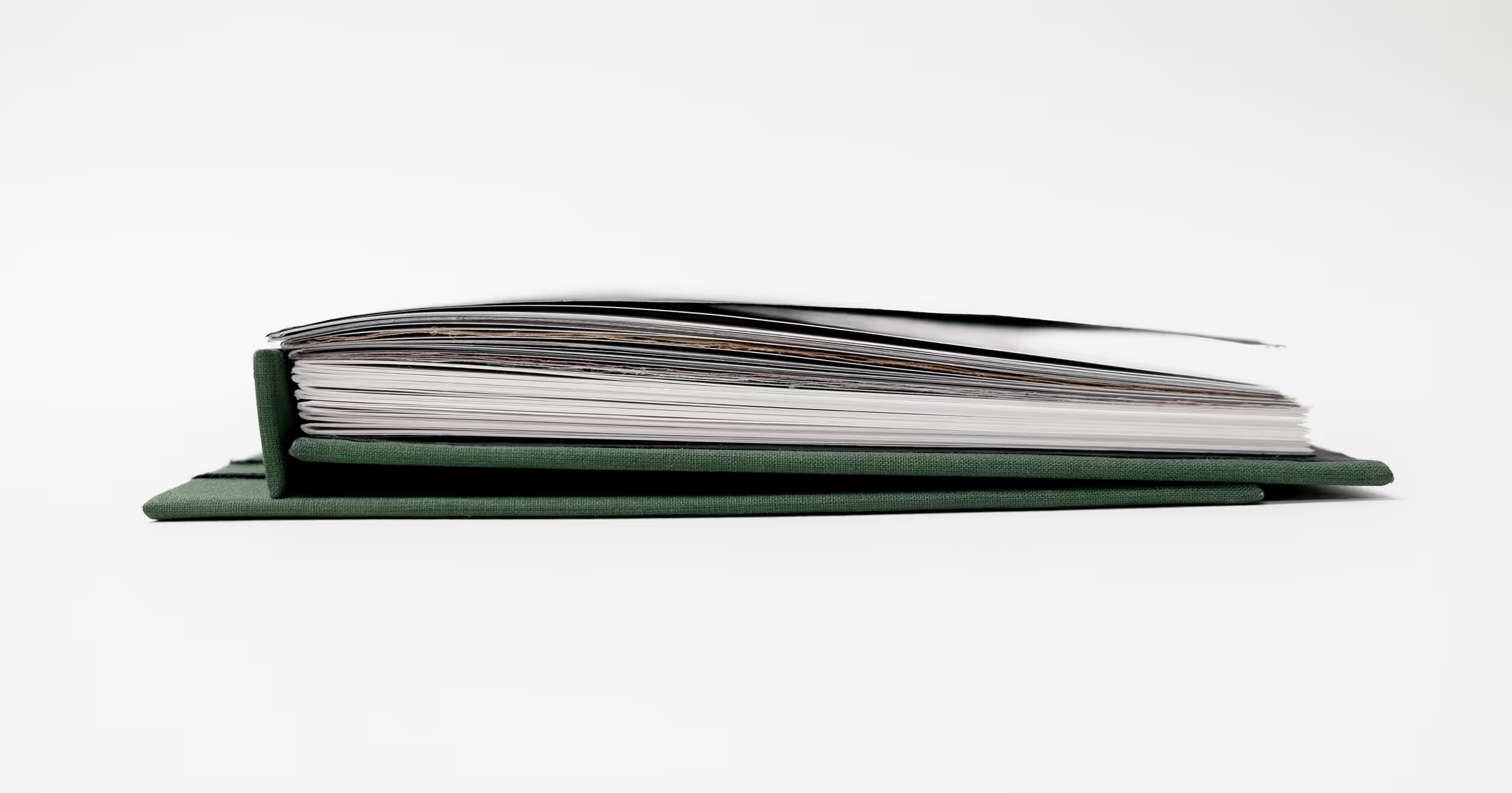
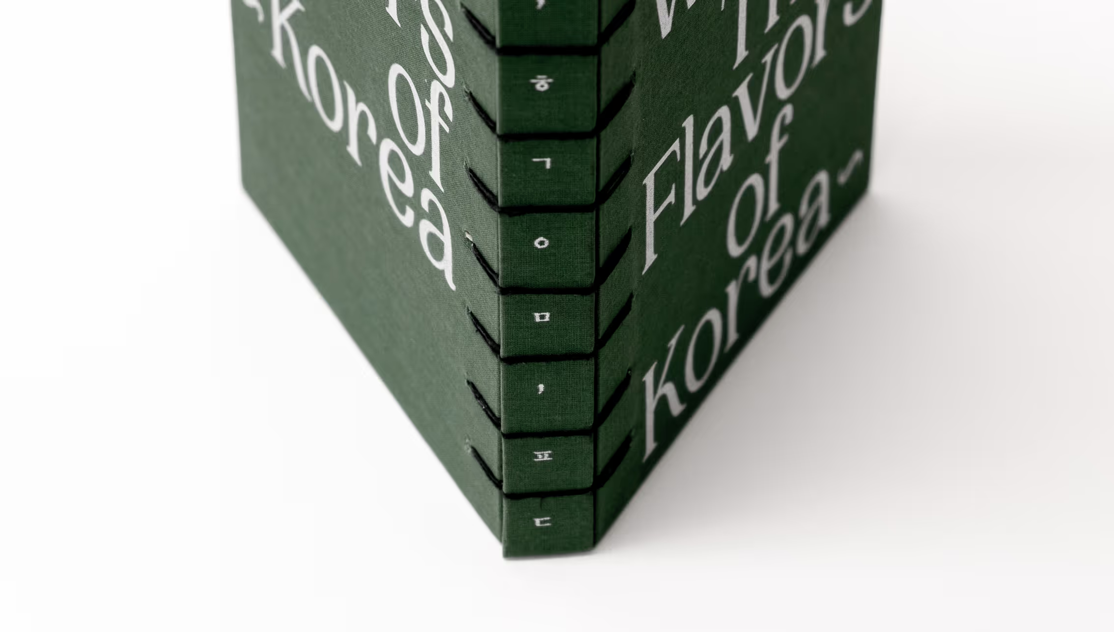
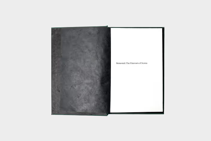
To capture the cookbook’s personality, the materiality and binding were carefully selected to reflect its organic theme. Glossy interior pages mimic the sleek texture of seaweed, while fibrous, semi-transparent Japanese papers—used for endpapers and section openers—echo the plant's delicate, natural structure. Each opener is color-coded to its specific algae group, tied together by bold black endpapers that match the binding thread.
For the construction, a crisscross binding was chosen to ensure the book lies perfectly flat, providing hands-free ease in the kitchen. This binding style also pays homage to the traditional Korean Ochime Anjeong (five-hole) binding style, bridging cultural heritage with modern functionality.
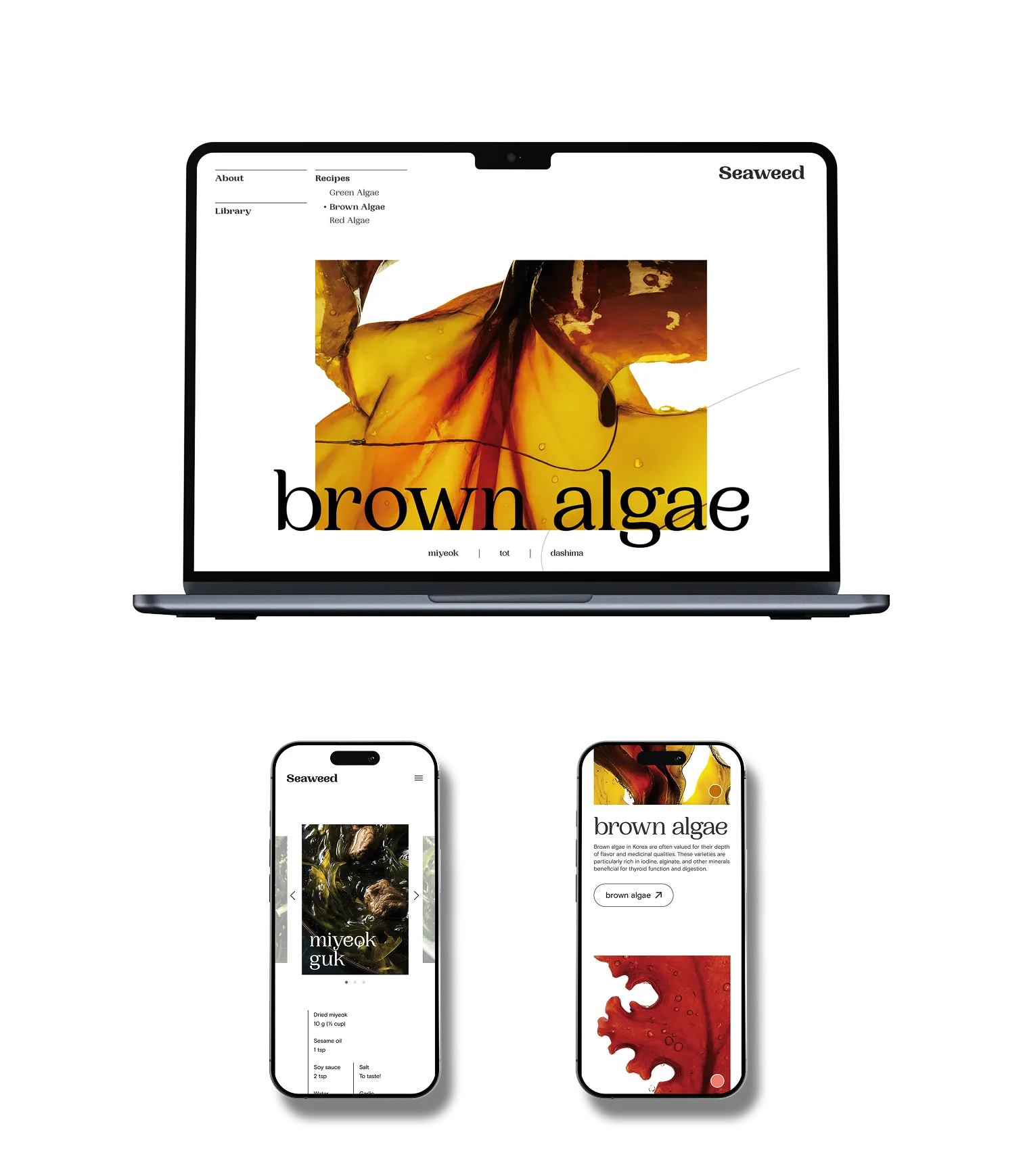
Expanding beyond the physical book, this project includes a responsive digital platform that brings the cookbook’s content to a wider audience. By optimizing the Home, About, and Recipe pages for all devices, the site ensures a seamless omnichannel experience, keeping the recipes accessible even when the printed version isn't on hand.
To translate the book’s tactile nature into a digital space, the interface integrates interactive micro-interactions, such as expandable accordion menus and responsive hover states. These subtle touchpoints provide clear visual feedback and real-time confirmation, ensuring the web experience remains as intuitive and user-centric as the physical publication.
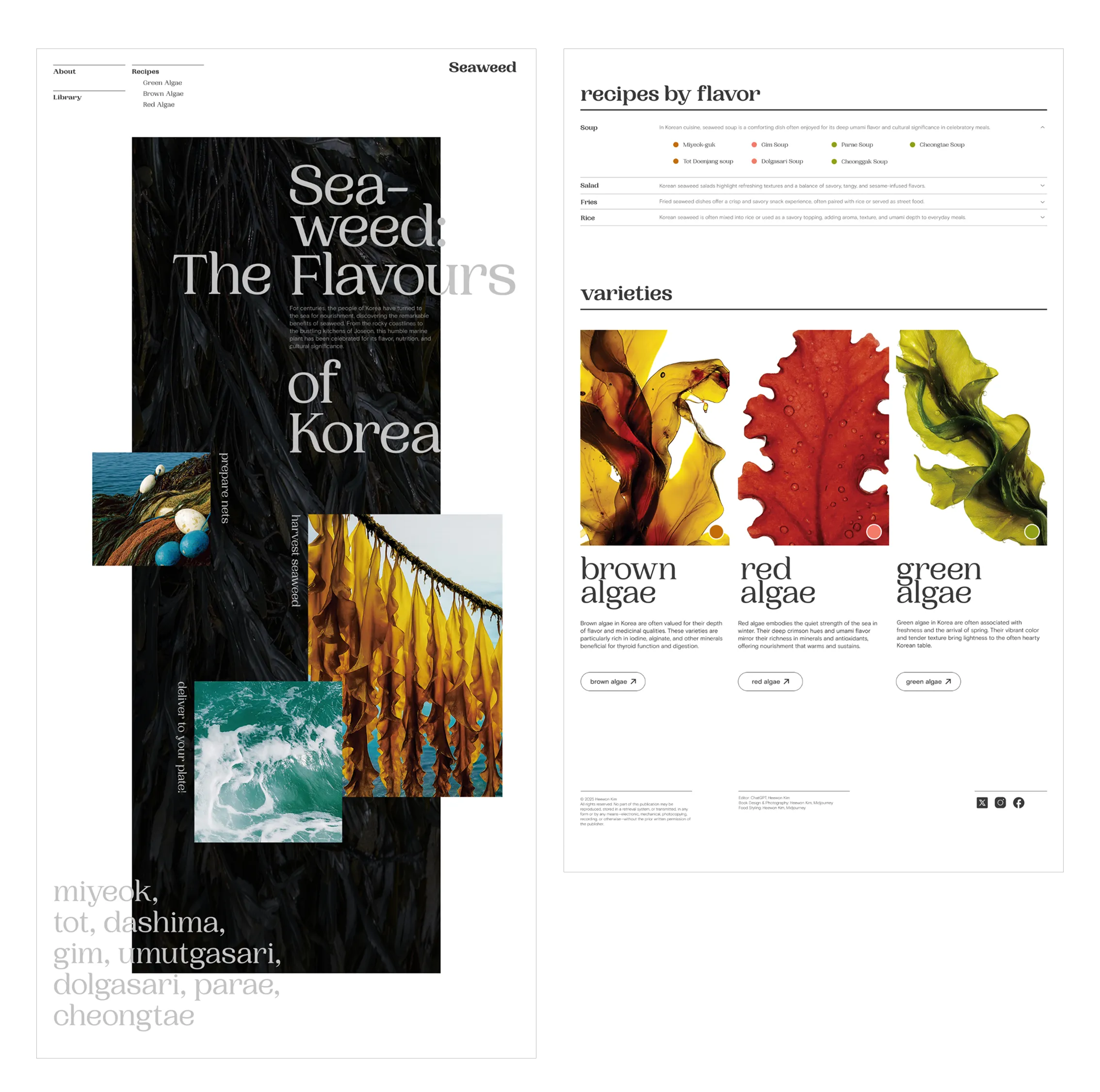
“Seaweed: The Flavors of Korea” was a comprehensive exercise in maintaining cohesive art direction across both physical and digital mediums. Beyond the visual identity, the process of sourcing materials that balanced the project’s organic concept with user-centric functionality was a highlight of the design journey. Ultimately, this project demonstrates how thoughtful materiality and a consistent mood can transform a cookbook into an immersive, cultural experience that is as practical in the kitchen as it is beautiful on the shelf.