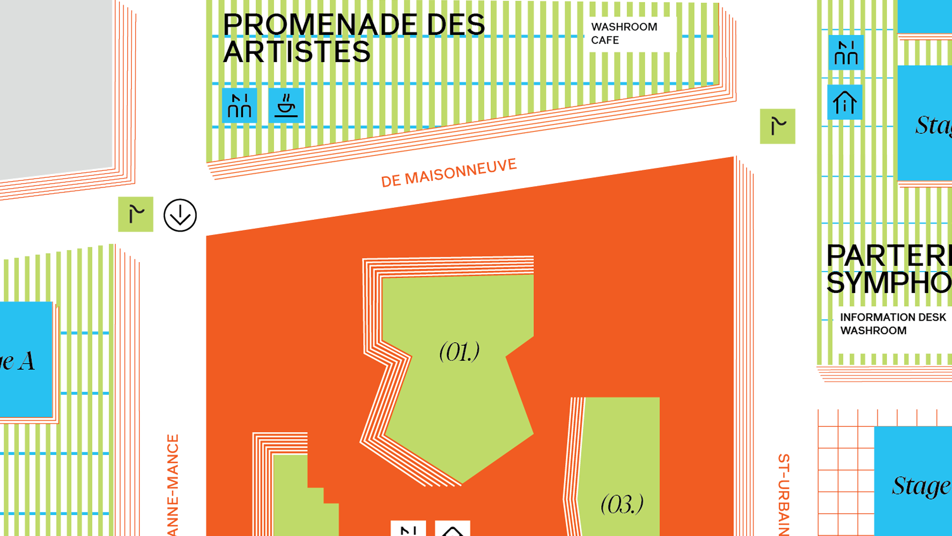
Designed for Pop Montreal Music Festival at Place des Arts, this wayfinding system optimizes outdoor accessibility through a strategic redesign commissioned by the Quartier des Spectacles. The project ensures seamless navigation across all festival stages and facilities while introducing a coherent visual rebranding.
Pop Montreal International Music Festival is an annual, five-day, not-for-profit cultural event in Montreal that champions independence and diversity in the arts, featuring a vibrant mix of music, film, art, talks, workshops, and family activities. Pop Montreal stands out for its curatorial approach, championing emerging and celebrated artists from diverse backgrounds with a do-it-yourself (DIY) ethos and an intimate, community-driven setting.
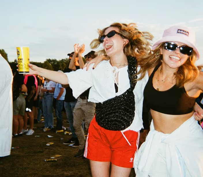
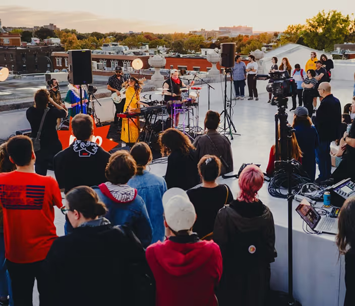
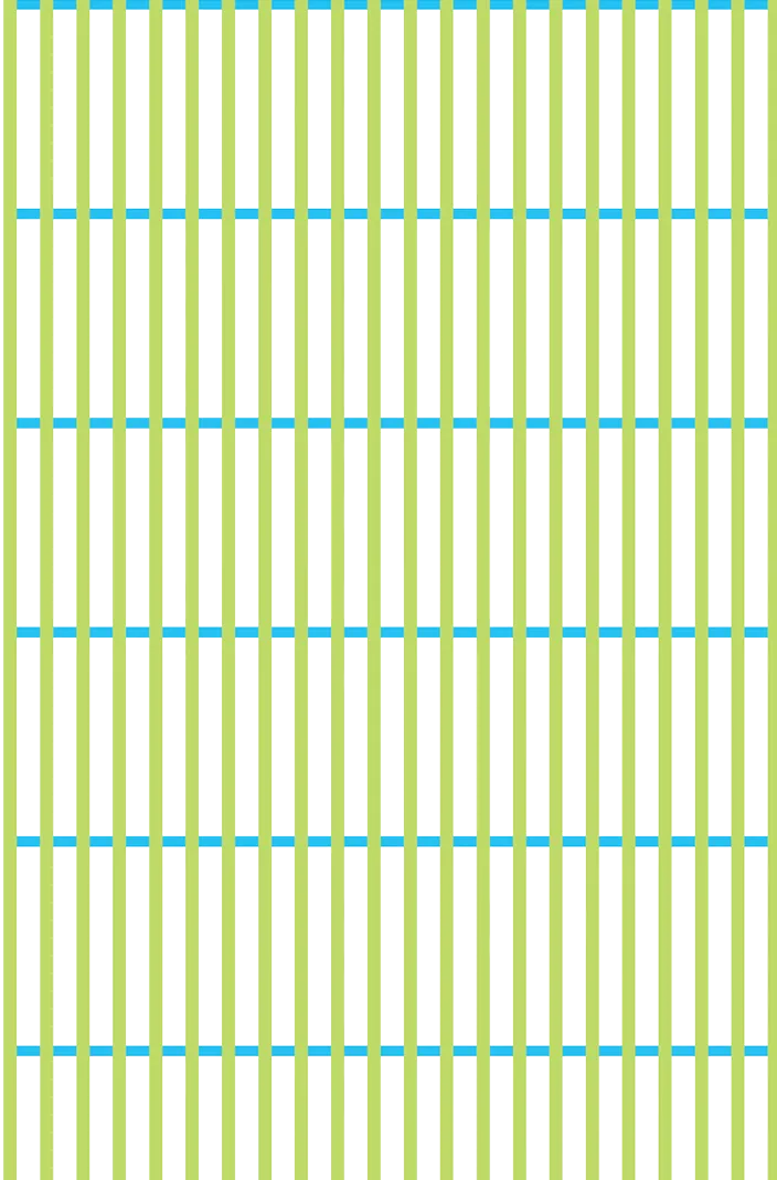
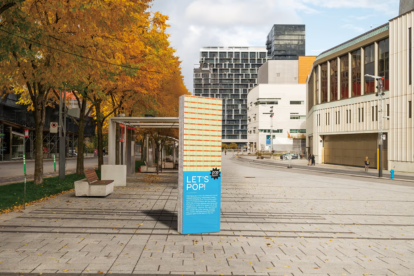
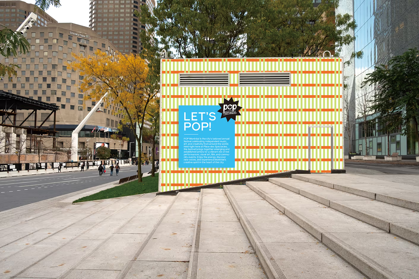
To reflect the energy of the music festival, the visual identity centers on the concept "Drawn Paths." Varied linear patterns symbolize the diverse narratives of international artists, forming an energetic tapestry that speaks to the festival’s inclusive spirit.

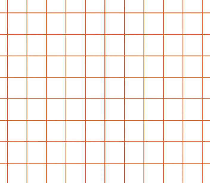
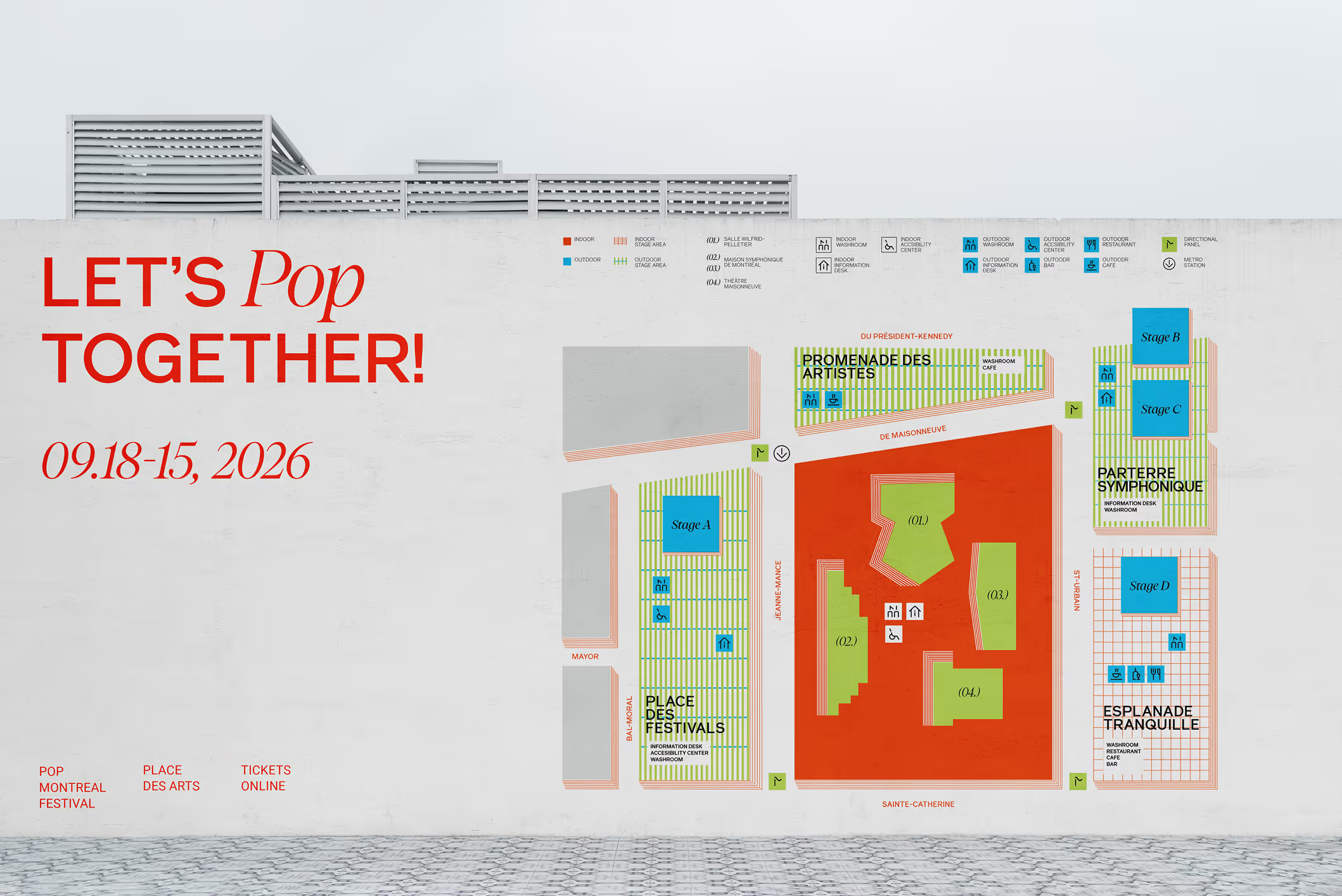
Each Pattern connects with each outdoor festival areas, which helps the users to distinguish the places. The colour palette, consisting of vibrant hues, orange, green, and blue, it plays a huge role to showcase the energetic mood of the festival.
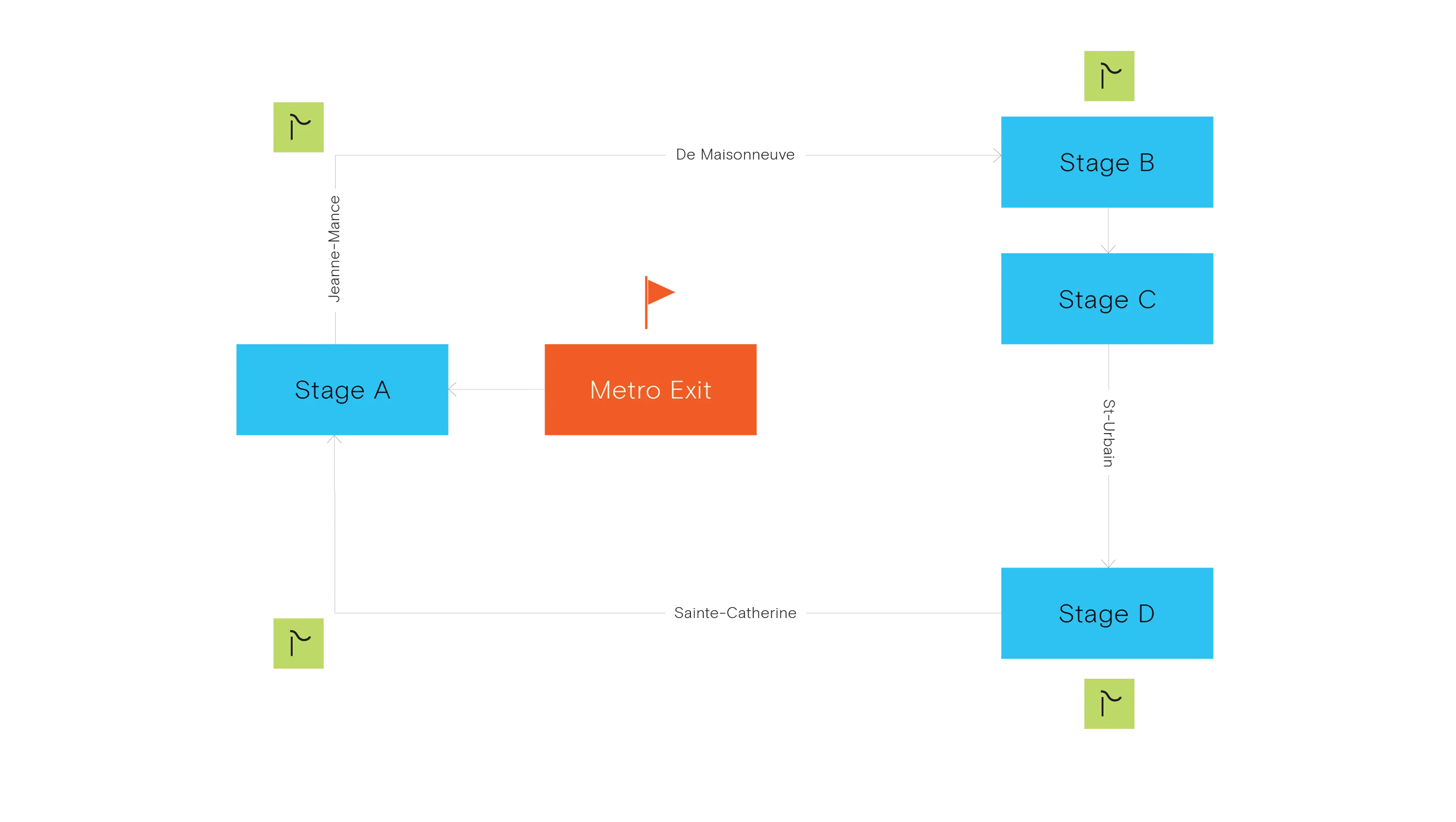
The project began with a comprehensive analysis of pedestrian flow at Place des Arts to determine optimal signage placement. By conducting on-site observations during the festival season and analyzing digital traffic data, I identified key entry points and potential friction zones.
This research revealed that the primary target audience—young adults aged 18 to 30—predominantly arrives via the Metro, establishing the Jeanne-Mance exit as the high-traffic "starting point" and central anchor for the wayfinding system.
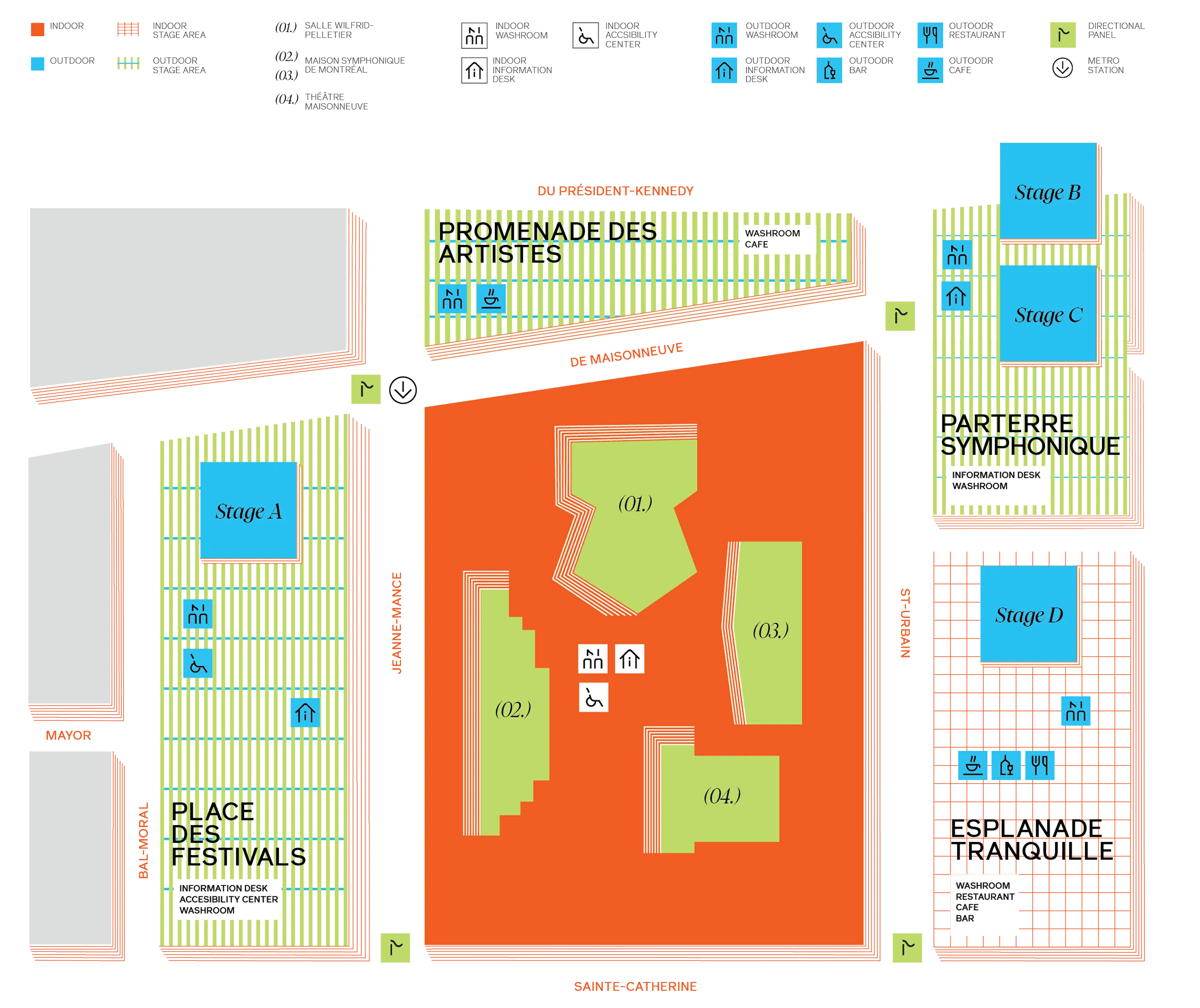
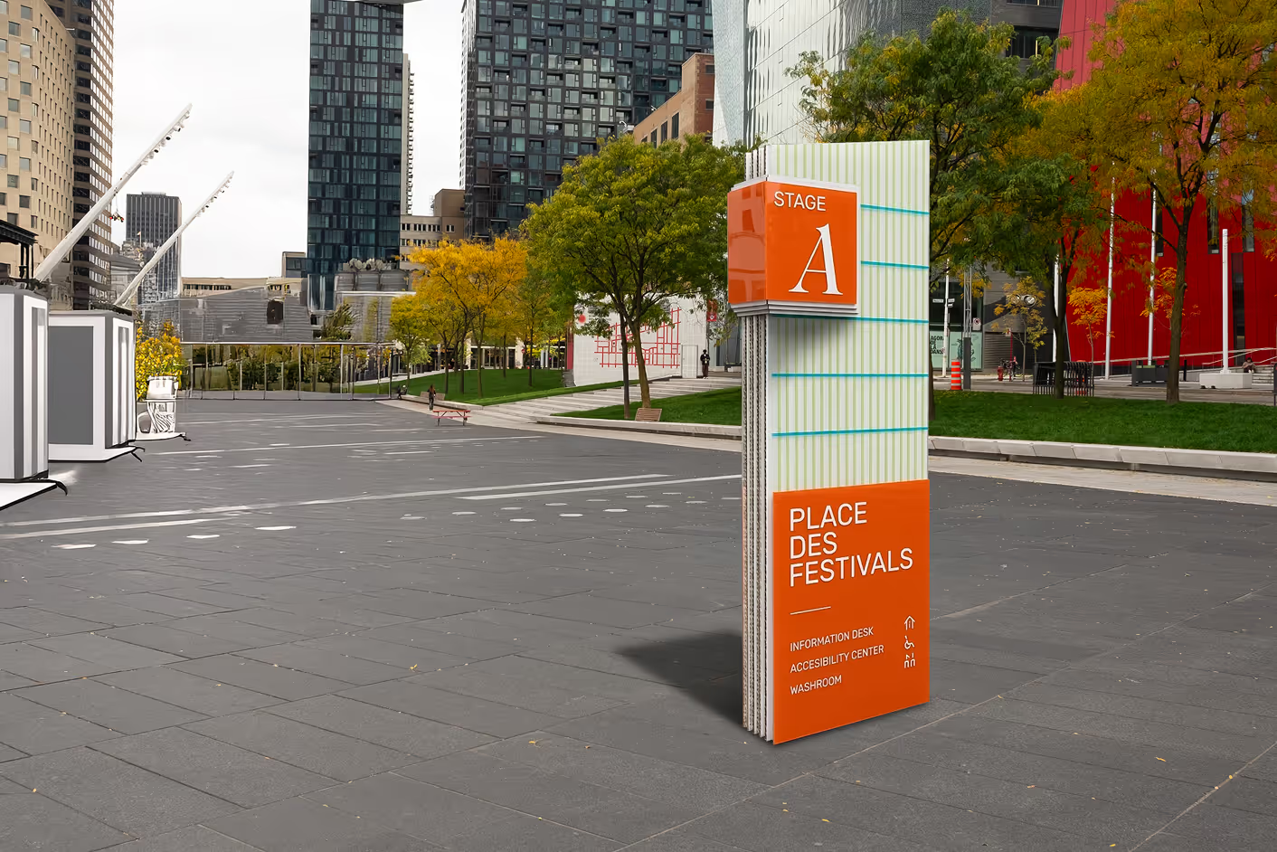
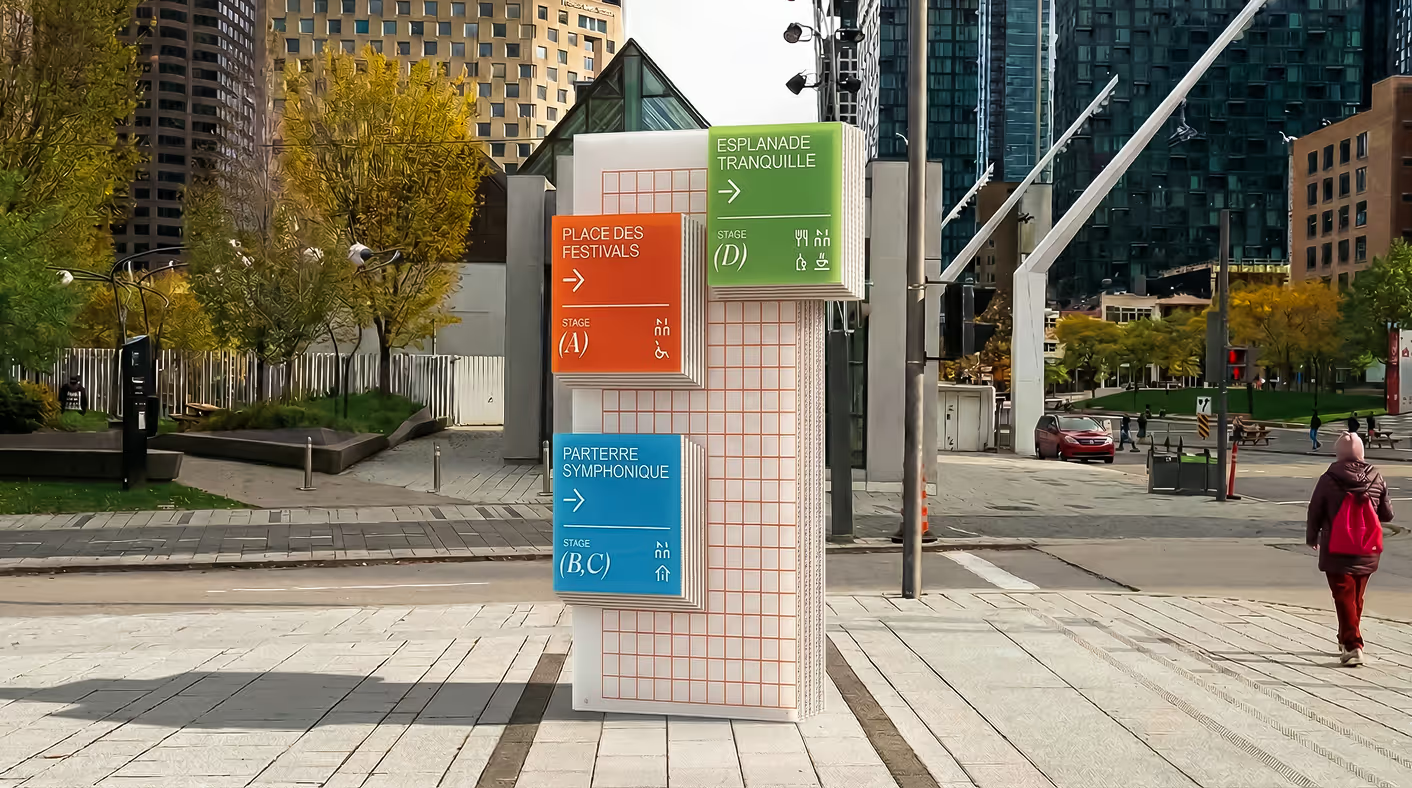
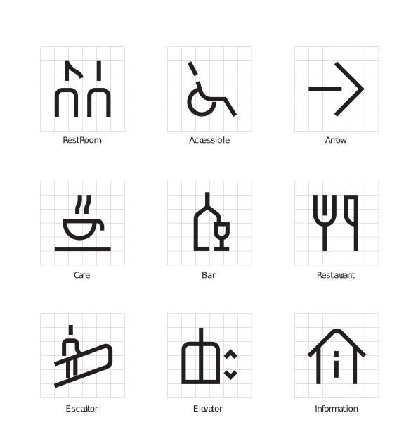
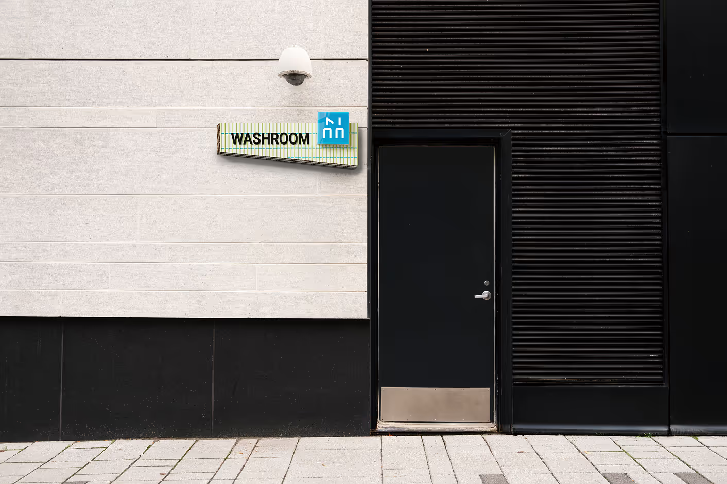
In response to these findings, the main directional signage is positioned at the Jeanne-Mance exit, supported by three supplemental panels at critical intersections—De Maisonneuve/St-Urbain, St-Urbain/Sainte-Catherine, and Sainte-Catherine/Jeanne-Mance—to prevent navigation errors at major crossroads. This journey is further supported by service panels placed consistently across both interior and exterior spaces, ensuring a seamless transition for attendees.
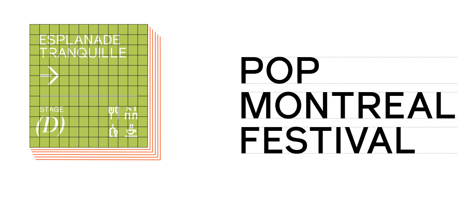
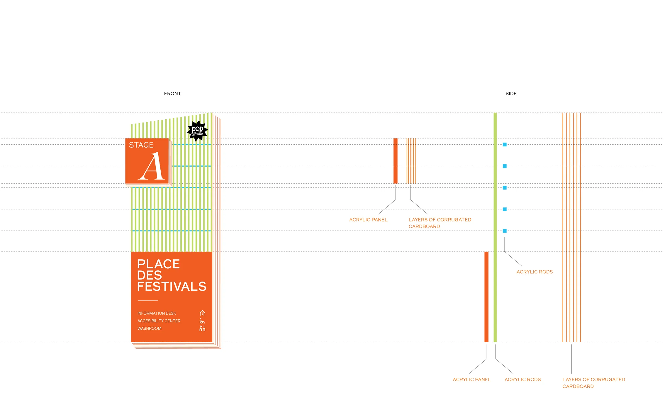
To optimize the expansive outdoor environment, the system utilizes a strict information hierarchy tailored for long-range legibility. By isolating stage numbers on secondary overhead panels, the design creates high-visibility "beacons" identifiable from a distance. The typography employs uppercase lettering with refined weight and kerning to prioritize stage data, ensuring attendees can navigate toward the festival's "heart" with minimal friction.
This wayfinding project highlights the critical balance between expressive brand identity and functional navigation. I learned that effective user experience thrives on simplicity and structure; by distilling complex pedestrian flows into a clear, hierarchical system, even the most vibrant environments can become intuitive. Ultimately, this project reinforced that the best design doesn't just decorate a space—it moves people through it with confidence and ease.